Tag: optimization

  • Why Your Website’s User Experience (UX) is Your Ultimate Competitive Advantage

    Why Your Website’s User Experience (UX) is Your Ultimate Competitive Advantage

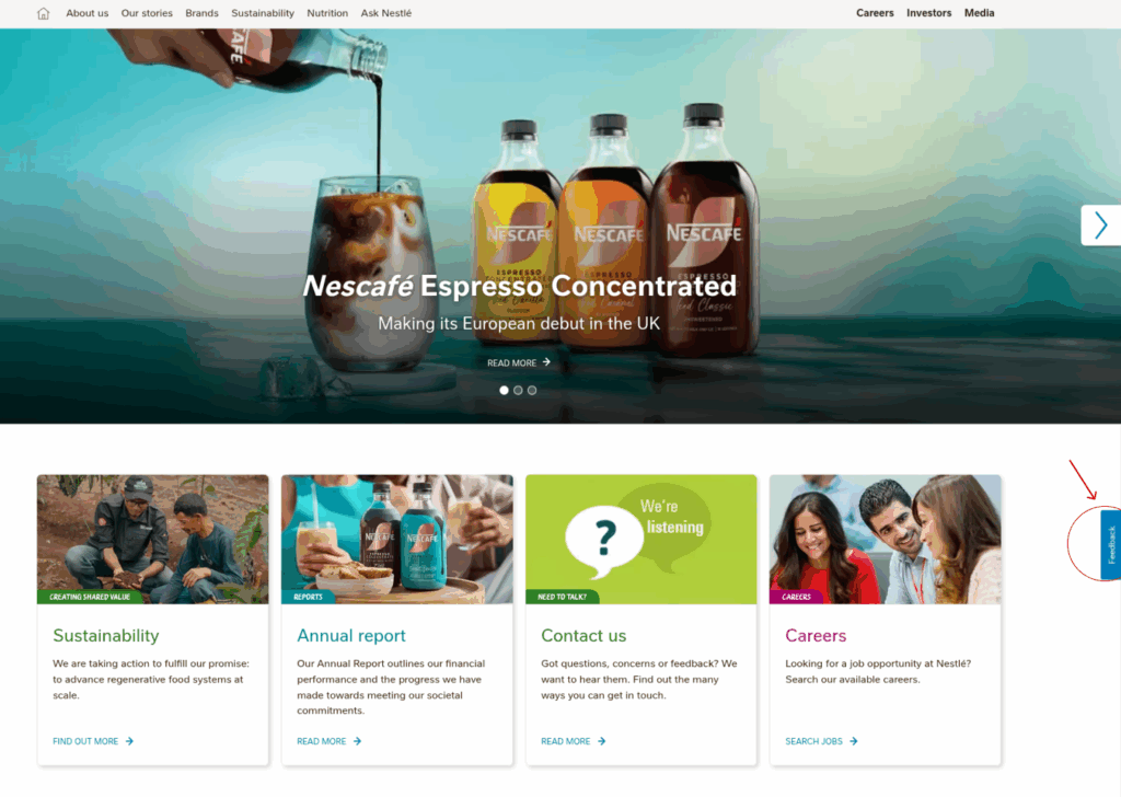
    In the fast-paced digital world, users expect websites to be effortless. They want to find what they need quickly, navigate intuitively, and complete tasks without frustration. When these expectations aren’t met, the consequences for businesses can be hurtful.

    Think about your online habits. Do you persevere if a website is confusing, slow, or difficult to use? Or do you hit the back button and find a competitor who makes the process easier? For most products and services, the latter is true.

    Unless your offering is a one-of-a-kind necessity – something users must have, regardless of the effort – a poor user experience is a direct invitation for them to seek alternatives.

    Customers aren’t looking for a challenge or fighting dragons to complete a purchase or submit an inquiry.

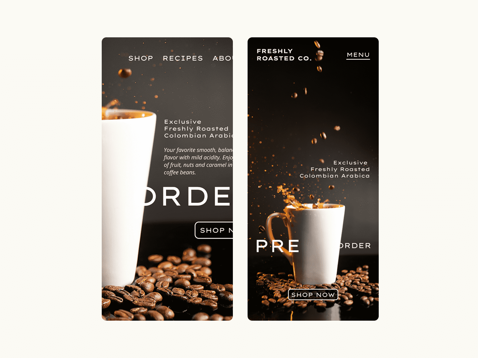
    We’ve all experienced the frustration. From endless pop-ups to complex checkout flows, poor usability can turn a simple transaction into a painful experience. While some unique cases (like a notoriously difficult-to-use flight booking site for the absolute cheapest travel deal) might force users to tolerate the pain for a specific, high-value outcome, the average business, unfortunately, operates on different terms.

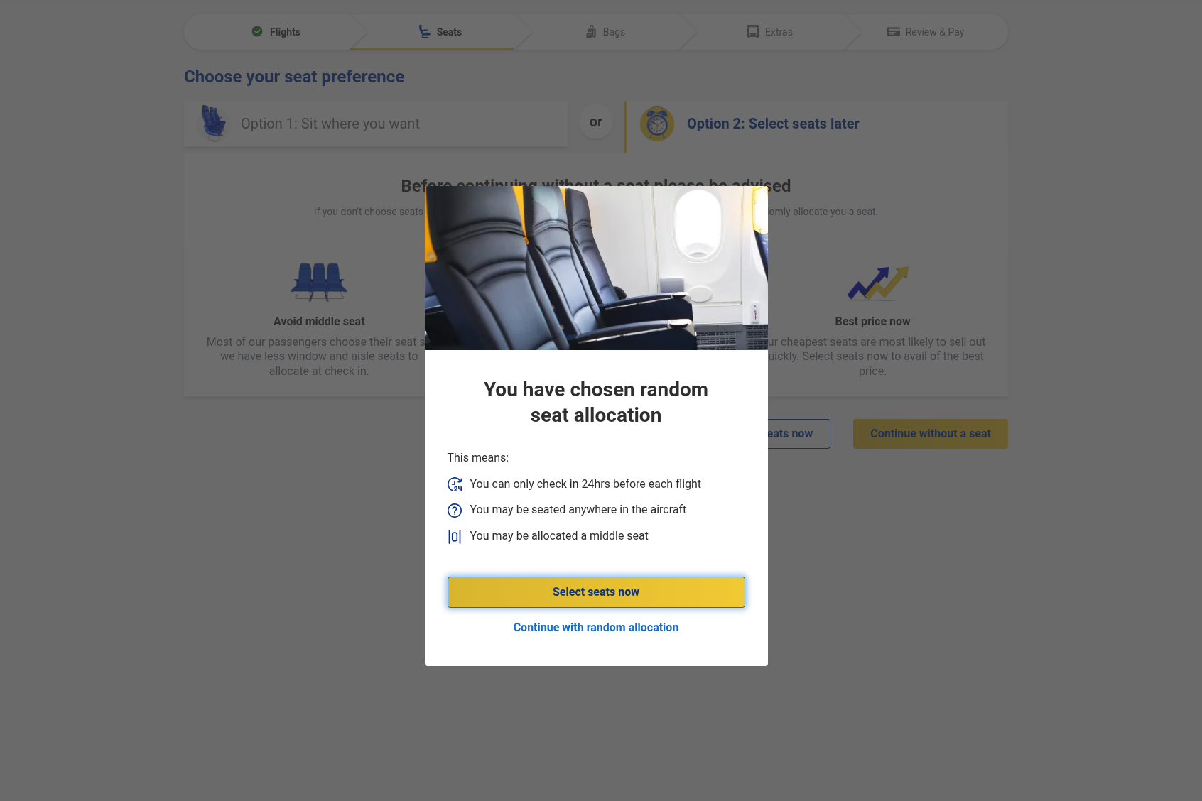
    You have seen this interface. One pop-up window after another, unchecking boxes, and exchanging your precious time for a “real deal” flight ticket.

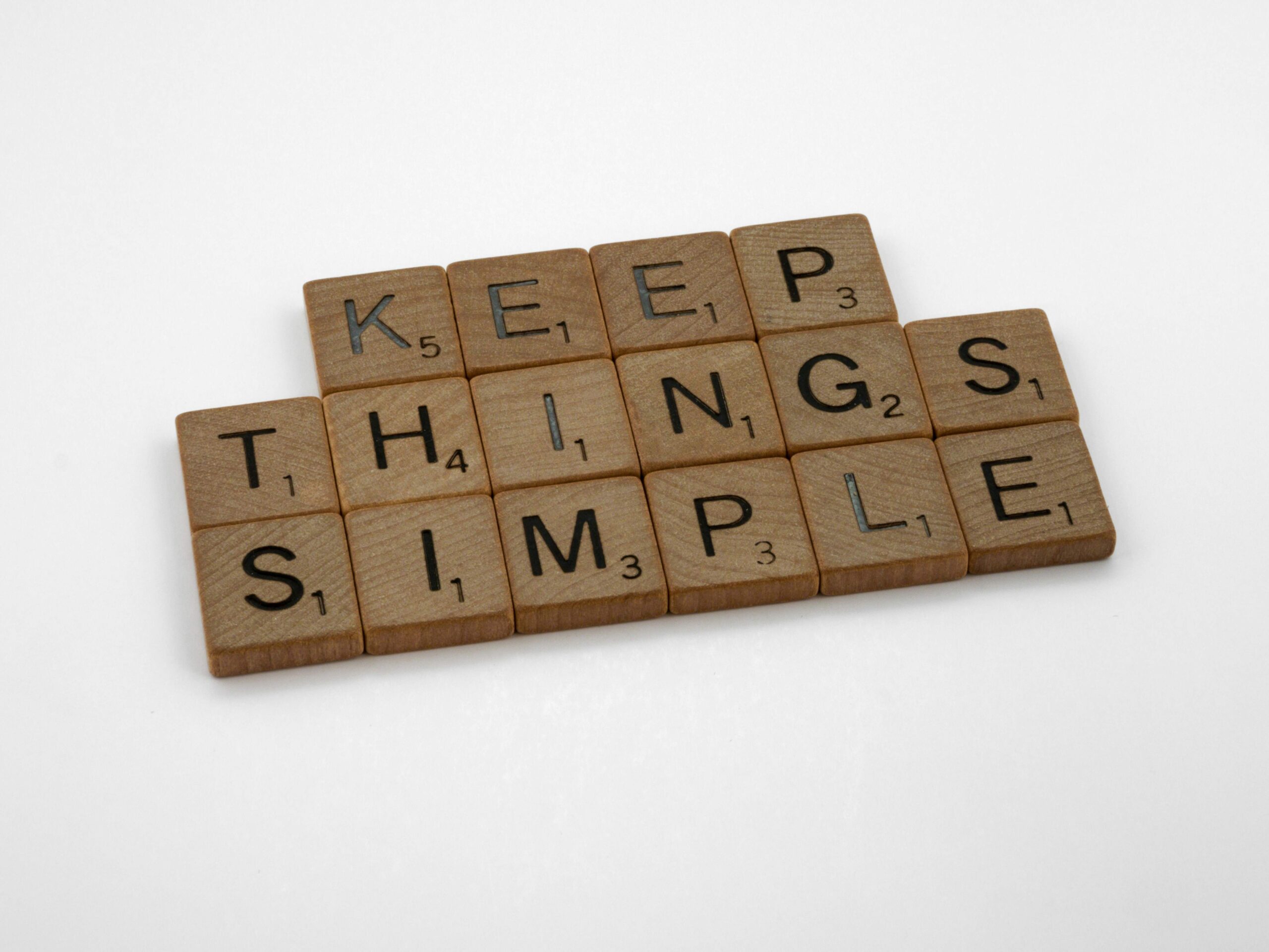
    Why User Friction Costs Your Business Conversions

    If your product or service is easy to replace, then every moment of user friction on your website serves as a barrier to conversion. Customers aren’t looking for a challenge or fighting dragons to complete a purchase or submit an inquiry. They’re looking for solutions delivered with ease. This is why investing in superior website usability isn’t just a best practice – it’s a critical business imperative.

    The Business Benefits of Exceptional Website Usability

    An intuitive, attractive, and user-friendly website directly contributes to:

    • Higher Conversion Rates that turn more visitors into leads and customers.
    • Increased User Satisfaction, building trust and repeat business.
    • Enhanced Brand Perception, positioning your business as modern, reliable, and customer-centric.
    • Improved SEO. User-friendly sites often perform better in search rankings.

    Is your website delivering the seamless experience your users deserve?

    As a proficient UX designer, I identify and resolve usability roadblocks. My approach involves in-depth analysis of your existing webpage to understand user behavior, pinpoint areas of friction, and implement strategic design solutions that improve engagement and drive your business goals.

    Let’s collaborate to make your digital presence a powerful asset.

    Schedule a review

    Get in touch to schedule a comprehensive review and discover how a focus on user experience can unlock new opportunities for your business.

  • Is Your Website Losing Customers? 10 Common UX Mistakes and How to Fix Them. Part 2

    Is Your Website Losing Customers? 10 Common UX Mistakes and How to Fix Them. Part 2

    In the previous blog post, we discussed the following UX mistakes:

    1. Confusing Navigation
    2. Slow Loading Times
    3. Non-Responsive Design
    4. Poor Readability
    5. Ignoring Mobile Users

    Want to see how to fix those mistakes? Then navigate to the “Is Your Website Losing Customers? 10 Common UX Mistakes and How to Fix Them. Part 1” blog post.

    In continuation, we will take a look at the rest of the top 10 common UX mistakes that make you lose customers. Let’s go!

    6. Lack of Clear Calls to Action (CTAs)

    Users need to know what you want them to do next. Vague or missing CTAs leave them directionless.

    Fix: Use clear and compelling action verbs (e.g., “Shop Now,” “Learn More,” “Contact Us”). Make your CTAs visually prominent with contrasting colors and sufficient size. Place them strategically where users are likely to take action.

    7. Ignoring User Feedback

    Your users are a goldmine of information. Ignoring their complaints or suggestions means missing opportunities for improvement.

    Nestle displayed a button labeled Feedback on the right side of all its pages

    Fix: Implement feedback mechanisms (e.g., contact forms, surveys, social media monitoring). Actively listen to and analyze user feedback. Use it to inform your design decisions.

    8. Intrusive Pop-ups

    While pop-ups can be effective for specific purposes, overly aggressive or poorly timed pop-ups can be annoying and lead to immediate abandonment.

    Fix: Use pop-ups sparingly and strategically. Be sure they are easy to close. I would recommend that you think twice before using pop-ups.

    9. Inconsistent Design

    A website with inconsistent branding, typography, and UI elements can feel unprofessional and untrustworthy.

    Fix: Develop a style guide and adhere to it across all pages. Maintain consistency in colors, fonts, button styles, and overall visual language.

    10. Neglecting Search Functionality

    A robust and easy-to-use search bar is essential for websites with a significant amount of content.

    Fix: Make your search bar prominent and easily accessible. Implement intelligent search features like auto-suggestions and typo tolerance. Ensure search results are relevant and clearly presented.

    Investing in good UX is not just about aesthetics…

    Investing in good UX is not just about aesthetics; it’s about creating a positive and efficient experience that builds trust, encourages engagement, and finally drives business growth. Don’t let poor UX silently sabotage your success – make user-centricity a priority in your web design strategy.

    Let’s improve it together

    Want a website that delights visitors and drives conversions? If UX design isn’t your focus, I can help. Contact me to discuss your site and how we can improve the user experience together.

  • Is Your Website Losing Customers? 10 Common UX Mistakes and How to Fix Them. Part 1

    Is Your Website Losing Customers? 10 Common UX Mistakes and How to Fix Them. Part 1

    Think of your website as your digital storefront. Just like a badly laid-out shop can prevent visitors from entering, a website with poor User Experience (UX) can drive potential customers away. You might have fantastic products or services, but if your online presence is frustrating to navigate or slow to load, you’re likely losing business without realizing it.

    So, is your website pushing customers towards your competitors? Let’s explore common UX mistakes and how to fix them.

    1. Confusing Navigation

    Imagine entering a store where you can’t find the aisles or the checkout. That’s how users feel on a website with unclear or inconsistent navigation. A logical and intuitive menu structure is crucial.

    Fix: Implement clear, concise labels. Keep your main navigation simple (ideally under seven items). Provide consistent placement across all pages. Use breadcrumbs for easy orientation on deeper pages.

    2. Slow Loading Times

    In today’s fast-paced digital world, patience is a virtue few online users possess. If your website takes more than a few seconds to load, visitors are likely to abandon it.

    Fix: Optimize images. Leverage browser caching. Minify CSS and JavaScript files. Consider a Content Delivery Network (CDN).

    3. Non-Responsive Design

    A significant part of online traffic originates from mobile devices. And if your website doesn’t adapt seamlessly to different screen sizes, it is a major turn-off.

    A visual example shows how a non-responsive design looks on a mobile screen (image on the left) and how it should look on a mobile screen (on the right)

    I remember those times when you needed to scroll the webpage horizontally on your phone because nobody had in mind that users would visit their website from a mobile device. The funny part is that there are still websites like those in the wild.

    Fix: Adopt responsive design principles. Ensure your layout, text, and images adjust fluidly to various screen resolutions. Test your website on different devices.

    4. Poor Readability

    Walls of text, tiny fonts, and low contrast can make your content difficult to read. Users are looking for information quickly and easily.

    A visual example shows an image with high contrast between text and background, and a low contrast image

    Fix: Use sufficient white space. Choose legible font sizes and styles. Ensure a strong contrast between text and background colors (aim for WCAG compliance). Break up large blocks of text with headings, subheadings, bullet points, and visuals.

    5. Ignoring Mobile Users

    Beyond just being responsive, the mobile experience needs specific attention. Cluttered layouts, tiny buttons, and complex forms are painful for smaller-screen users.

    Fix: Prioritize mobile-first design. Simplify navigation for touchscreens. Make buttons and interactive elements large enough to tap easily. Simplify forms and minimize required fields.

    Transform your website from a potential customer repellent into a powerful conversion tool by addressing these common UX mistakes.

    Read the second part of the “10 Common UX Mistakes and How to Fix Them.”

    Stop losing customers due to poor UX.

    Don’t have the time to fix it yourself? Contact me for a professional website analysis and expert solutions to boost your conversions