
Think of your website as your digital storefront. Just like a badly laid-out shop can prevent visitors from entering, a website with poor User Experience (UX) can drive potential customers away. You might have fantastic products or services, but if your online presence is frustrating to navigate or slow to load, you’re likely losing business without realizing it.
So, is your website pushing customers towards your competitors? Let’s explore common UX mistakes and how to fix them.
1. Confusing Navigation
Imagine entering a store where you can’t find the aisles or the checkout. That’s how users feel on a website with unclear or inconsistent navigation. A logical and intuitive menu structure is crucial.
Fix: Implement clear, concise labels. Keep your main navigation simple (ideally under seven items). Provide consistent placement across all pages. Use breadcrumbs for easy orientation on deeper pages.
2. Slow Loading Times
In today’s fast-paced digital world, patience is a virtue few online users possess. If your website takes more than a few seconds to load, visitors are likely to abandon it.
Fix: Optimize images. Leverage browser caching. Minify CSS and JavaScript files. Consider a Content Delivery Network (CDN).
3. Non-Responsive Design
A significant part of online traffic originates from mobile devices. And if your website doesn’t adapt seamlessly to different screen sizes, it is a major turn-off.

A visual example shows how a non-responsive design looks on a mobile screen (image on the left) and how it should look on a mobile screen (on the right)
I remember those times when you needed to scroll the webpage horizontally on your phone because nobody had in mind that users would visit their website from a mobile device. The funny part is that there are still websites like those in the wild.
Fix: Adopt responsive design principles. Ensure your layout, text, and images adjust fluidly to various screen resolutions. Test your website on different devices.
4. Poor Readability
Walls of text, tiny fonts, and low contrast can make your content difficult to read. Users are looking for information quickly and easily.
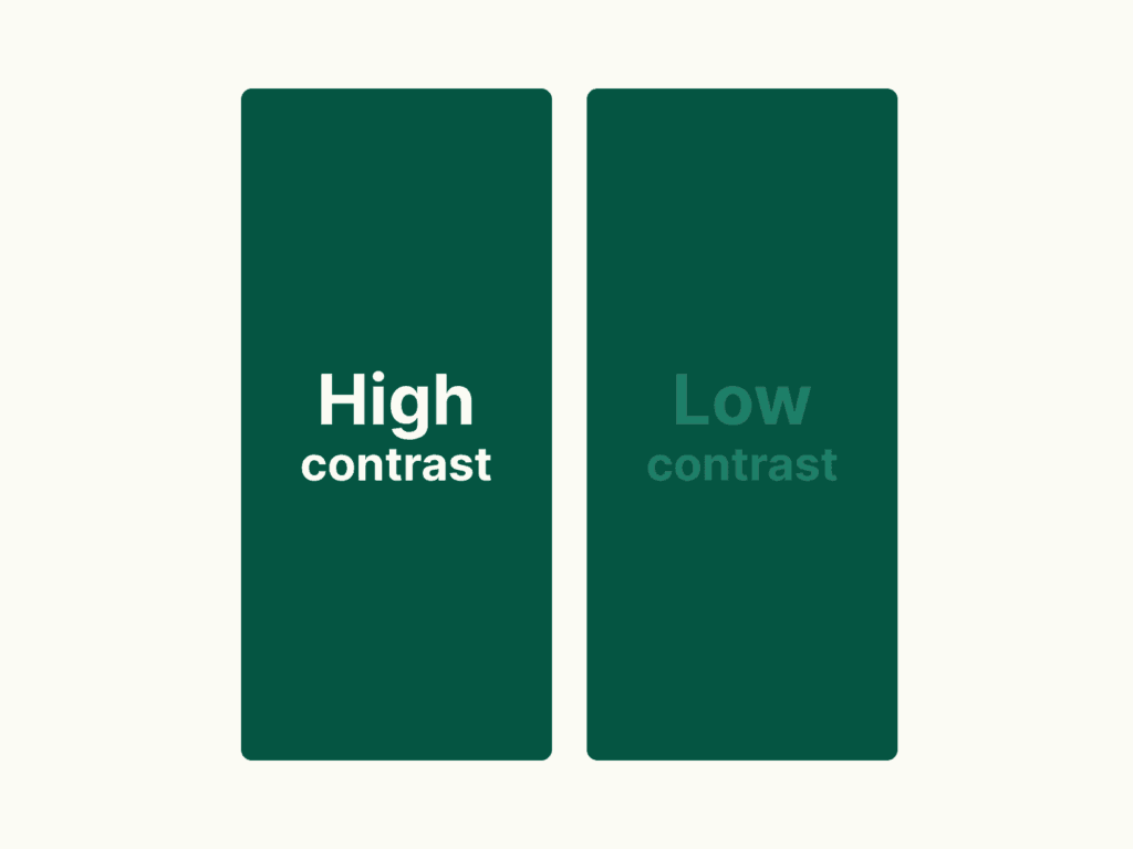
A visual example shows an image with high contrast between text and background, and a low contrast image
Fix: Use sufficient white space. Choose legible font sizes and styles. Ensure a strong contrast between text and background colors (aim for WCAG compliance). Break up large blocks of text with headings, subheadings, bullet points, and visuals.
5. Ignoring Mobile Users
Beyond just being responsive, the mobile experience needs specific attention. Cluttered layouts, tiny buttons, and complex forms are painful for smaller-screen users.
Fix: Prioritize mobile-first design. Simplify navigation for touchscreens. Make buttons and interactive elements large enough to tap easily. Simplify forms and minimize required fields.
Transform your website from a potential customer repellent into a powerful conversion tool by addressing these common UX mistakes.
Read the second part of the “10 Common UX Mistakes and How to Fix Them.”
Stop losing customers due to poor UX.
Don’t have the time to fix it yourself? Contact me for a professional website analysis and expert solutions to boost your conversions